Refer to the Card Design Standards published on mastercardconnect.com

1. Choose the correct Cirrus branding (“logo”) for your specific use. See Configurations for more guidance.


2. Always provide sufficient contrast with the background. See Background contrast.


3. Always surround the logo with sufficient clear space. See Minimum clear space.


4. For cards, please get guidelines and artwork from the Card Design Standards at mastercardconnect.com
5. Always reproduce the logo at a size that is clear and legible. See Minimum size.
6. When referencing Cirrus® in text, use an uppercase “C”. See Using the Cirrus name in text.
7. The Cirrus Brand Mark must always include the word “cirrus”. There is no symbol-only version of the Brand Mark.


Cirrus Brand Mark
The Cirrus Brand Mark is comprised of the Cirrus circles and associated trademark symbol ™ and the word “cirrus” followed by a registered trademark symbol ®. The Cirrus Brand Mark is used in materials created by Mastercard, its issuers, acquirers, and co-brand partners to market and promote Cirrus products and services.
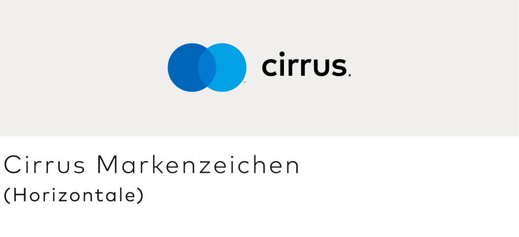
- The Cirrus Brand Mark is available in both vertical and horizontal configurations. Use the one that best fits your needs.
- Full-color, grayscale, and solid versions are available for use on white or light backgrounds (“positive”) and black or dark backgrounds (“reverse”). See Color specifications.
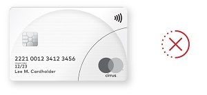
- Grayscale and solid versions must never be used on the chip side for physical cards or the visible side when a card is represented visually in any digital payment environment.
- Artwork is available for download and must not be altered.
- Download artwork for acceptance and marketing here.
- Download artwork for cards at mastercardconnect.com.
VERTICAL CONFIGURATION


HORIZONTAL CONFIGURATION


Note: The ™ and/or ® trademark symbols (or other symbol required under local law) must be used. They must remain at the relative size provided in the authorized artwork files and be scaled proportionally with the marks even though their legibility may be compromised when the marks are at very small sizes or reproduced in certain media. The trademark symbols (or other symbol required under local law) must not be enlarged independently to increase legibility.
Decal stickers
- The decal sticker (also known as the “Acceptance mark”) is comprised of the Cirrus Brand Mark on a black background.
- Decal stickers and other signage must not be printed in grayscale.
- Decal stickers are physically printed signage used to signify acceptance at retail locations such as on door decals, card terminals, or ATMs.
- Artwork is available for download and must not be altered.

- The Cirrus Brand Mark is available in full-color, grayscale, and solid versions. The solid version may appear in black, white, or any single color (provided there is sufficient contrast to the background).
- On physical cards, the Cirrus Brand Mark must be printed in full-color match PANTONE®* only. For more details, refer to the Card Design Standards published on mastercardconnect.com
- The decal sticker is available in full-color only and must be reproduced in full-color match PANTONE only.
- Colors are built into the downloadable artwork files and must not be altered.
COLOR
Cirrus Dark Blue Cirrus Medium Blue Cirrus Light Blue
RGB: 0/102/186 RGB: 0/122/208 RGB: 0/162/229
HEX: 006656 HEX: 007AD0 HEX: 00A2E5
CMYK: 98/55/0/0 CMYK: 87/35/0/0 CMYK: 82/8/0/0
PANTONE: 2144 C PANTONE: 2172 C PANTONE: 299 C


GRAYSCALE AND SOLID
Cirrus Dark Gray Cirrus Medium Gray Cirrus Light Gray
CMYK: 0/0/0/75 CMYK: 0/0/0/52 CMYK: 0/0/0/28


Note: Color specifications apply to vertical configurations as well.
* The color values shown here have not been evaluated by Pantone, Inc. for accuracy and may not match the PANTONE Color Standard. Consult correct PANTONE Color Publications for accurate color. PANTONE® is the property of Pantone, Inc.
** For online/digital RGB use or PANTONE printing, the trademark symbol (™) next to the blue circle must be reproduced in Cirrus Light Blue. For CMYK printing, the trademark symbol (™) must be black for the positive mark or white for the reverse mark. For all uses, the registered trademark symbol (®) to the right of the word “cirrus®” must be black for the positive mark or white for the reverse mark.
To ensure legibility of Cirrus branding, never use the logos at sizes smaller than the minimum size requirements.


Cirrus branding must appear in an uncluttered space free from text and other graphics.
- Surround the vertical Cirrus Brand Mark with clear space of at least ¼ the width of one of the circles.
- Surround the horizontal Cirrus Brand Mark with clear space of at least ½ the width of one of the circles on the left and right sides, and ¼ the width of one of the circles on the top and bottom.


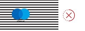
Sufficient contrast between the background and the Cirrus branding is required


Lettercase
When referencing Cirrus® in text, use an uppercase “C”. Cirrus must appear in the same font as its surrounding text. The name must not be modified in any way. The name may appear in all uppercase letters only if the font style of the user interface or communication also appears in all uppercase letters.


Registered trademark symbol (®)
In the first or most prominent text use of the word Cirrus on a page or screen (after use, if any, in a headline), the ® trademark symbol (or other symbol required under local law) is required. In subsequent use on that page or screen, the ® trademark symbol may be omitted.
Read-through
Cirrus branding may be used as a read-through in a headline, but may not be used as a read-through in the body of a communication. When used in text, it must be set in the same typeface as the surrounding text.


Trademark attribution notice
When the Cirrus name and/or Cirrus Brand Mark are used, the following trademark attribution notice must be included once in the communication:
- Cirrus and the circles design are registered trademarks of Mastercard International Incorporated or its affiliates.”
Note: On small-size marketing communications, the above trademark attribution notice is not required.
Translations
The Cirrus name must appear in English only. The Cirrus name must not be translated into other languages nor appear in another alphabet except for specific authorized versions in Chinese (translation), Arabic (transliteration), Korean (transliteration), and Georgian (transliteration).
Parity
In communications that promote more than one acceptance mark, the Cirrus name and/or branding must be presented with size, frequency, color treatment, location, and prominence equal to that of all other acceptance marks and/or logos presented.
Note: As used on Brand Center, an access mark is any name, logo, sound, haptic, visual depiction, trade name, logotype, trademark, service mark, trade designation, and/or other designation, symbol or mark not licensed by Mastercard, that identifies a service through which a Mastercard, Maestro, or Cirrus account can be accessed and/or accepted for a Mastercard, Maestro, or Cirrus transaction.
All Cirrus® branding, including the decal stickers, must be displayed at the point of interaction where payment options and/or access marks are presented.
At the point of interaction, Cirrus branding must be displayed at parity (in terms of size, frequency, color treatment, and location) with all other acceptance marks displayed. If both Mastercard and Cirrus branding are present, Mastercard must appear in the first position and Cirrus in the second position.
At the point of interaction, Cirrus branding, including the decal stickers, must be afforded similar prominence to any access mark displayed (characteristics to consider for similar prominence, include size, frequency, color treatment, and co-location within the same field of vision).
Illustrative, but not exhaustive, examples of compliant displays follow.


Note: All point of interaction (POI) locations that accept Cirrus must display a Maestro Mark at parity (in terms of size, frequency, color treatment and location) with all other acceptance marks (with the exception of Mastercard POI locations in the U.S., where a specific regional Standard that permits otherwise exists. Refer to Mastercard Rules, Rule 5.12.1 “Discrimination” of Chapter 16, “Additional U.S. Region and U.S. Territory Rules”).
Note: Gray boxes in the examples of displays represent a payment option or access mark, as applicable. As used on Brand Center, an access mark is any name, logo, sound, haptic, visual depiction, trade name, logotype, trademark, service mark, trade designation, and/or other designation, symbol or mark not licensed by Mastercard, that identifies a service through which a Mastercard, Maestro, or Cirrus account can be accessed and/or accepted for a Mastercard, Maestro, or Cirrus transaction.
Use at physical merchant locations
For complete information, refer to Use at physical merchant locations.
Use at digital merchant locations
For complete information, refer to Signaling digital payment acceptance.
Mastercard family of brands
When more than one Mastercard brand is accepted, display the marks horizontally or vertically in the approved sequence:
- Mastercard®
- Maestro®
- Cirrus®
All use of card images in marketing materials must comply with the requirements specified in the Card Design Standards manual published on mastercardconnect.com, and the requirements below:
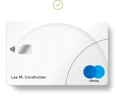
- The card image must include Cirrus Brand Mark on the chip side for physical cards or the visible side when a card is represented visually in any digital payment environment in compliance with the Card Design Standards in full-color and at the exact size as it would appear on the actual card plastic.
- The entire chip side for physical cards or the visible side when a card is represented visually in any digital payment environment (including the entire Cirrus branding) must be fully visible, clear, and legible.
- The display of account information is optional. If included, the account information (the Primary Account Number (PAN), the effective date and/or expiration date, and the cardholder name) and all card face design requirements must be in accordance with the requirements set forth in the Card Design Standards.
- When a cardholder name is present on the card image, the issuer must use the name M. Molina in the Latin America and the Caribbean Region or the name Lee M. Cardholder or John M. Cardholder in all other Regions.
- When a PAN is present on the card image:
- Either a BIN assigned to the issuer by Mastercard or 012345 followed by any combination of digits up to 16 digits must be present on the card image.
- Card images must be present at a size that is clear and legible.
- When a card image is not present, or the issuer name/logo does not appear on the card image, the following statement must appear on the marketing material in a location chosen by the issuer: “This card is issued by [Full Issuer Name] pursuant to license by Mastercard International Incorporated.”
- Cirrus cards must be depicted at parity (in terms of size, frequency, color treatment, and location) with all cards depicted in the same communication. Refer to Using with other payment options and access marks.
Illustrative examples of compliant displays follows.


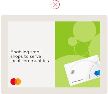
Illustrative examples of non-compliant card images follows.

- The full Cirrus program name must be used in the first occurrence (e.g., [Issuer Name] [Co-brand Partner Name] Cirrus®).
- After the first occurrence, the full Cirrus program name may be abbreviated to “Cirrus” or the issuer or co-brand partner name (e.g., [Issuer Name] Cirrus®) in subsequent occurrences within the same communication, and must appear in the same font as the surrounding text.
- The word “card” must not be a part of a card program name, e.g., [Issuer Name] Cirrus® is correct and [Issuer Name] Cirrus® Card is not correct). However, when you are referring to the “card” in marketing materials, the word “card” is recommended to be included (e.g., “Your [Issuer Name] Cirrus® card has a host of benefits.” or “Your [Issuer Name] Cirrus® has a host of benefits.”).
- Mastercard-provided program identifier artwork used on cards (as defined in the Card Design Standards) must not be used in marketing materials except when being displayed on a card image.
For information on using the Cirrus branding on ATMs, refer to the Use on ATMs section of the Mastercard Branding Requirements.
Consistent presentation of Cirrus® branding benefits issuers, acquirers, and merchants, by promoting consumer recognition and card use that builds business. Here are some common mistakes to avoid:
Do not create a symbol-only version of the Cirrus Brand Mark.

Do not recolor any part of the Cirrus Brand Mark.


Do not outline the Cirrus Brand Mark.

Do not display or reproduce at insufficient resolution or size.


Do not reconfigure or reposition individual elements of the Brand Mark.


Do not create a grayscale decal sticker.

Do not position the word “maestro®” within the circles.

Do not alter, add, or combine other text to the word “maestro®”.

Do not use a grayscale or solid mark on the visible side when a card is represented visually in any digital payment environment.